This call for help is going out to all of you lovely readers out there, whether you’ve been in this wild ride with me from the very beginning or this is your first time just dropping in, I want to know what you think! Since this upcoming cookbook is for you guys or people like you, I would love to hear what your idea of a good cover picture and font type would be. Together with my brilliant publisher, Alisa, we’ve whittled down the choices to a small list, form which I’d be most appreciative if you would pick your favorite. I know that this would all be a whole lot easier if I could figure out how to set up an anonymous poll… But I can’t, because I’m simply not that tech-savvy. Sorry!
Please, take just a minute to write a brief little comment – Even if I don’t know you personally, your opinion carries the exact same weight as anyone else’s when making the final decision!
So, without further ado, here are our cover picture candidates…
1) Wasabi Chocolate Cupcakes

2)Triple Threat Chocolate “Cheese” Cake

3)Pumpkin Pecan Pie

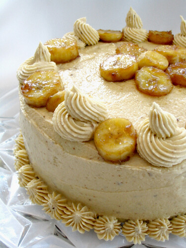
4)Bananas Foster Cake
5)Mocha Devastation Cake

6)Brilliant Berry Parfaits

And for the font…

Thank you to everyone for helping out, I really do appreciate your honesty in this. Don’t worry if I don’t respond to your comment; Every single one still counts, and you never know – Yours could be a deciding factor!
hm. This is a hard choice! I expect the cupcakes fervor might soon be coming to an end, but I love your cupcake photo! It is definitely the best photo of the bunch, but I would hate for the cover to look “done”. So I choose either the Bananas Foster Cake or Pecan Pumpkin Pie photos.
As for the font, I find E the most appealing, hands down. It is legible, but still has an interesting flourish. It looks as though it is the one that could have the most longevity, style-wise, and it could be used throughout the book (in headers and titles) without becoming tiresome.
6+E!
3 and B
I think my real favorite photo is #4, but I think there are people who don’t like bananas, so I wouldn’t put it on the cover. But that’s just my opinion.
I must have stumbled into the cookbook crowd, it seems like every blog I read is writing a cookbook! I want to write my own, as well.
I like the berry parfaits or the banana foster best!
As for fonts, B or F!
Hmm, this is hard! For the font I easily and immediately choose E. For the photos I am torn between #3 the pumpkin pecan pie and #6 the brilliant berry parfaits. Though, I can’t wait for the recipes for the chocolate cheesecake & bananas foster cake, look sooo good!!! Well good luck! Hey just curious, but what are your personal faves?
i like font choice D
Enough with cupcakes…..
5 , you can never fail with chocolate and for a font either E or F.
2 and E. I liked the cupcake photography the best but cupcakes have been so overdone.
I hesitate between the #1 and 6.
The font I like best is the C and I don’t really like the E or the F cause it look kind of old-fashioned and the E has been often use for a font in a book.
1E
number 2 and 6 are nice for pictures
for font i like A because it is different
keep up the good work!
I honestly like all of your pictures, however I think that 3)Pumpkin Pecan Pie and 4) 4)Bananas Foster Cake would be best suited for a cover. The other pictures are either missing something, or have too much. I like how 3 is laid out and would be really nice with the cover text. I kind of feel like the berry parfait picture would work if it was cropped more on one side. OR to put the text sideways, which would be super interesting (F text).
As for font, I actually B or F… I think F would work really well with 3.
Great work!
the boyfriend and i like 1, 3, and B but they are all gorgeous, really. : )
I think the cupcakes look the best and font B looks the ‘smartest’ to me
the cupcakes! and F for the font.
3 and D
I really do like them all.
Can’t choose between 3 and 4. Ah, so hard ;}
The font – definitely E.
Can’t wait for the cookbook!
2 + E
2 is a classic shot =) it give the shot a lot of dimension and the setting of the plate + slice of cake + cake in the background works very well. 3 is nice but somehow the color scheme seems too restricted.
E because it looks like hand writing. personal. =)
Either 2 or 4 for the cover pic. I like the “differentness” of #2. As far as the font, E.
Photo 1 with font E. I like photo one the best as it is uncluttered, therefore more striking. The colours are very striking too. I think simplicity like this is best for a front cover. Font E is really cool, and reminds me of the retro styling of the sublime stitching website and patterns. I think the two together would give a lovely retro vibe, without being too chintzy and cluttered. I’d like photo 2 more if the plate was plain – I really have a thing against crockery with writing on (we all have our weird taste aesthetics!), and I also think it detracts from the food a little. Slight negativity aside, I think they’re all great! Well done!
1 & B – simplicity is best, the cupcakes picture seems to draw you in , it’s not just another still life food picture
Oh – it all looks so tasty! Hard to choose – so either the Berry Parfaits or the Pumpkin Pecan Pie. I like font choice B best – but I seem to be the only one!
i vote B or F
I vote for pics 1 or 6 and fonts B or E.
This looks yummy! Let us know when/where it’s out!
Absolutely, without a doubt, #5 – the Mocha Devastation Cake. The name is so catchy and appropriate! Think about it… It looks like regular cake but the “devastating” part is that it is in fact VEGAN! Hahaha. Seriously, though, that is a beautiful picture and would grab my attention right away.
As for the fonts, the one that goes best with the Mocha Devastation Cake (in my opinion) is A.
So my vote is 5A
Reading through the comments, it seems that font “E” is the most popular. I was torn between A and E so I could go with 5A or 5E…
My favorite are: 4)Bananas Foster Cake and 6)Brilliant Berry Parfaits
they looks elegant, and so good!
font: E
Love the cupcake photo the most, but I agree, it’s overdone.
I choose 2E.
I think you should put either 1 or 2 as the cover photo. Show that vegan deserts doesn’t just mean fruits to us carnivores out there. That way you’ll be more likely to get at least a few ‘non-vegan’ customers who might otherwise pass up such yummy recipies because they fear ‘vegan’ means aweful (which it doesn’t!)
I like font c or f. I can’t tell you why, other than they seem mostly non-fussy. I like simple and elegent.
I like picture #3 – it looks like the pie has a pearl necklace on!!! I think font F would be the best match for that picture…something about the picture is playful, almost like the dessert is peeking at you. :-) Good luck!
Wasabi cupcakes and F!!! I am looking forward to the recipes.
1A definitely.
The cupcake photo has a nice, clean feel to it and an appealing contrast in the colors. And I like the whimsical look of A.
3 & d for me….
I like font E, and I like photo 2. Font E, to me, is the easiest to read. When I am looking at books, if I can’t read the cover, I’ll skip pasy it. Photo 2, Triple Threat Chocolate, nuff said.
I’m not a Vegan, but I would definatly buy your book.
How about a split-photo cover? I could easily see the left half of 4 next to the right half of 3. Double the yum factor!
My synopsis: I like 1) and 2); 3) and 4) look a bit simplistic; 5) seems a bit cliche and 6) I like but the blue background is a bit plain. For fints I prefer d), e), b), f) in that order. And it is so great that you asked your readers for input – cheers!
For fonts I like B and E.
I agree with those who think the cupcake photo is the best, but I’m going to have to go with the berry parfait for the cover. It fits with the title the best. I like photo #2, but it doesn’t say “My Sweet Vegan,” to me, it says something more like, “My After-Dinner With a Martini and Newspaper Vegan.” Or something.
And hey! Congrats on the cookbook! :D
Okay, my favorite for a picture and font is:
3)Pumpkin Pecan Pie
Font B.
I would buy the book just for the Triple Threat Chocolate Cheese cake!
i like the 1st picture and the E. font :D
the B font is cool too ^.^
I say why choose from all those beautiful photos? Why can’t you have a nice collage of all those photos that depicts all the things that you can make vegan? I can just imagine a strip of photos that horizontally goes across the middle of the front cover or photos that align to the right or left. Maybe I’m just unconventional? :) Anywho, I like font E the best. Good luck on the cover!
I like the composition of the cupcake picture and I think I like “B’ font.
I like photo #1 and font B. Simple and clear, and dare I say sweet :-) in my opinion.
Best of luck!
I love the textures captured by photos #1 and #4, but I’m really loving the lighting in #4 and the simplicity of the shot. I think font E would go well with #4. Congrats on your cookbook, btw! :)
6 & B!
I think that before I decide which picture you should use for the cover of your book, I need to have a sample taste of all the goodies that you took pictures of! That way then I could really give you my true feelings on which picture should be on the cover!! So just let me know when you will be making all those wonderful baked goods and I’ll be right over!!
I think that any of the pictures would be great! I can’t wait for your book to come out so that I can go buy it!! Just looking at the wonderful pictures is making me hungry!!
I really like letter D for the font!
Keep up the good work sweetie! I love reading about all that you are doing!!
Any time you need a taste checker just give me a call and I’ll come right over!!
Wasabi Cupcakes and F.
One more thing, I didn’t choose font E because it has a 50’s feel, and the 50’s were so not vegan…
Triple Threat Chocolate “Cheese” Cake and E
I like fonts E & F
I also like the berry parfaits.
I agree with the many people who’ve stated that cupcakes are too omnipresent. Sometimes I don’t think I can’t stand to see another cupcake picture on the flickr vegan baking pool.
My eye is really caught by the cupcakes. One reason is the color, another reason is it looks like something I could bake and probably would, as the other choices look too tough for me to tackel. It looks like something you could “dress up” if needed and looks like it could be very portable.
I like the first set of fonts.
Good Luck!
1. Chocolate sells. I think it is a proven fact. I also think a vegan cookbook that shows something that looks “creamy” would have make a positive impression on the potential buyer. So with that in mind the choc cheesecake or mocha cake. I also like the idea of a multiple image cover so you could show range. Just make sure you include something chocolate and creamy.
2. You want a font that not only looks good but can be read easily and can be seen clearly from a distance as well as conveying the sweet vegan idea. With that criteria in mind the font MUST be E. It is readable, not too gimmicky or feminine (men buy cookbooks, too) and still conveys a nice image.
Congratulations and good luck.
Wow, thanks for asking us! I can’t wait to have my hands on the final print! For me, i really like 2 or 4 for the dessert because they really show the non-vegans out there just how gorgeous and decadent vegan desserts can be, and as for font, i like E. Good luck!
So the “Cheese” cake made me drool the most! I think that font A would complement the pciture the most. It gives it that french flair. I cannot wait for this cookbook after seeing just the teaser pictures!
Such a hard choice! but I think the chocolate cheese cake (2) is my favourite and I agree with Brooke, I think that font A compliments this photo well. I eagerly await to see the finished product, whatever the font or photo may be :)
#1 and B.
i would have to pick Bananas Foster Cake and option E for the font. shit, that cake looks GOOD!!!!
ps.. hey, why is it that i had no idea that you were writing a cookbook!??! when will it come out!?
Wow, they all look so yummy! My choice is the cupcakes and font E. Have fun deciding!
first picture, and E font!
I like photos 2 or 5 and for the font – E or F.
I like photo number 3 and font A. All the photos are gorgeous though! Congratulations :D
picture 2 or 5
fonts b or f
I think that #4 is the perfect cover picture! It looks fancy enough to inspire the consumer, yet not too daunting to intimidate them.
I also like font B, since it has a cutesy, old-fashioned look to it.
I love your website and am thrilled that you are writing a cookbooks. Good luck in all you do.
Destiny
Cheesecake and B. I do like E but I think it has been used too often on books.
I can’t wait!
6 and E. The berry parfait looks so cool and inviting. But the cake (5) looks wonderful as well. Any of the fonts would do the job, but E is nice.
All of the photos are lovely – so it’s a difficult decision – I think I like 5) Mocha Devastation Cake the best – chocolate is wonderful and the presentation is very pretty. I like font E the best.
Best Wishes
Teresa
For the picture, 1, 5, or 6
For the font, B or E
Good luck!
OK! 4 and 5 are the 2 that got my attention! Not only pretty and yummy looking but they have that “touch of class” for a cover. Font “F” is what strikes my eye as the most “crisp and readable”.
Mmmmm… they all look fantastic! I say the Berry Parfait is the best for the cover. So many cookbooks focus on chocolate [yum] that it would be nice to have a fruity desert on the cover. [oh, and those cupcakes look delicuous!!]
As for font… I’d say either E or F. Def. not number 1 because it almost looks like ‘my sweaty vegan’. Best of luck!!
Sorry to chime in so late! Congrats on the cookbook, it’s about time you did one!
My first choice of cover is Triple Threat “Cheesecake”, followed by Wasabi Chocolate Cupcakes.
My favorite font is F, followed by D. These two make me think most of my impression of you.
Good luck with this eagerly awaited project!
I like 5 + F the best.
Good luck with the book.
1 or 6 and E! Good luck with the project! :)
3B
I love the last font (F). It really seems to fit the title.
I also love the parfait picture – the colors are really eye catching.
Looking forward to checking out the cookbook -if your still trying to decide I personally like the 1) wasabi chocolate cupcakes with the A or C font. LOVE your bog